
Take Care
Client
Take Care
Place
Brazil
Type of Work
Branding
Packaging
Packaging
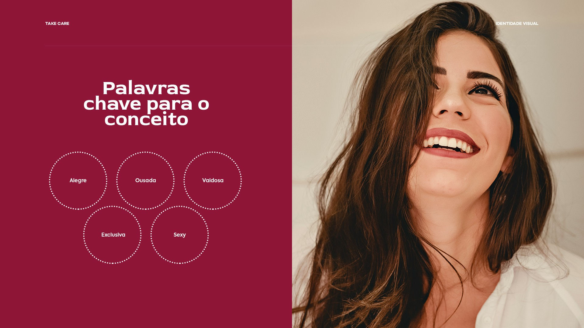
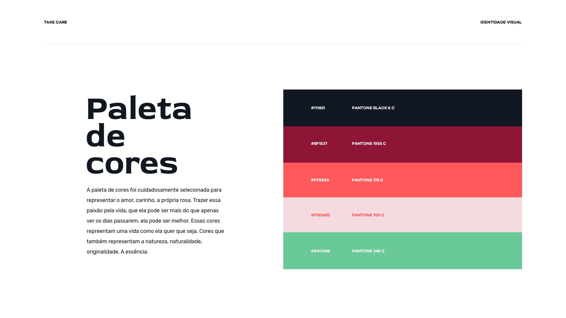
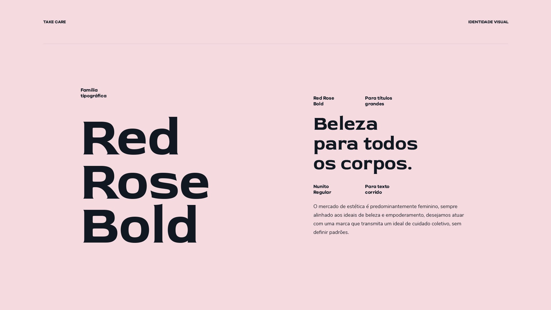
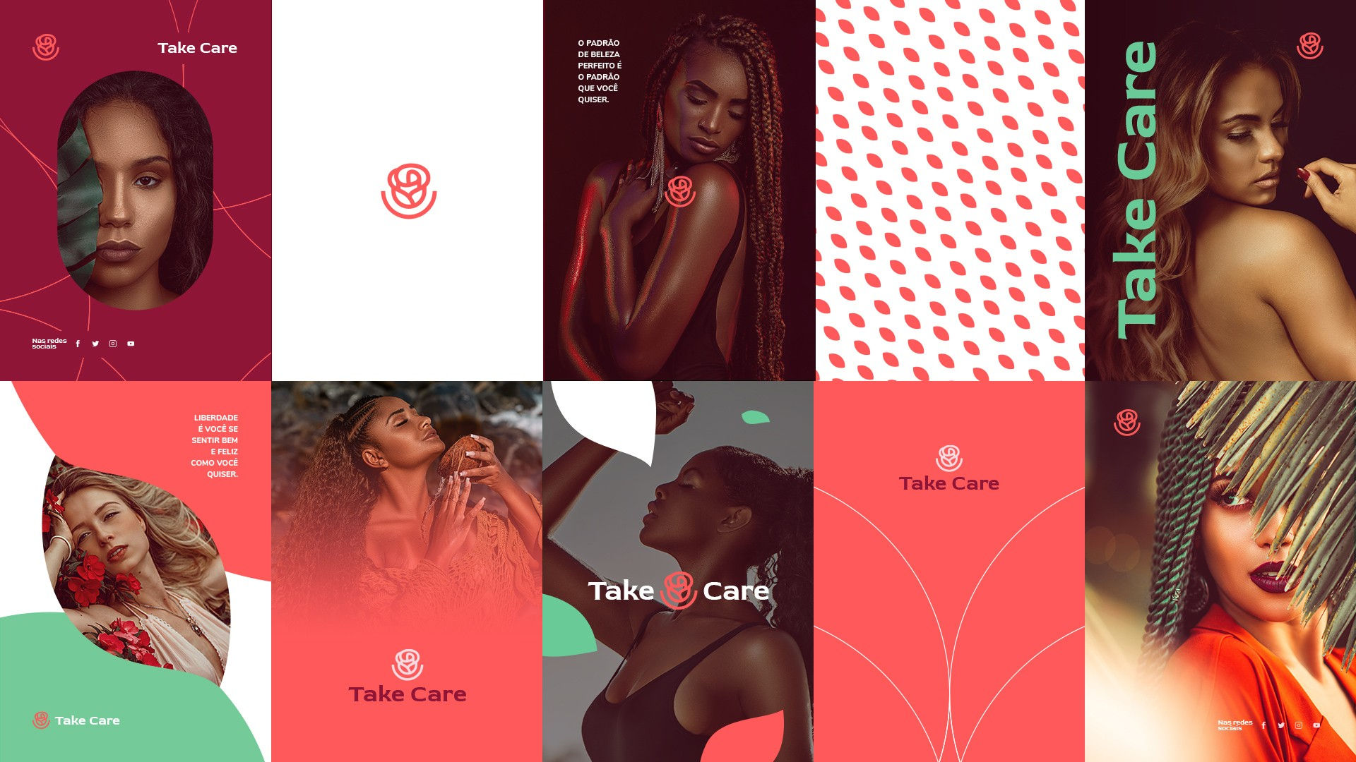
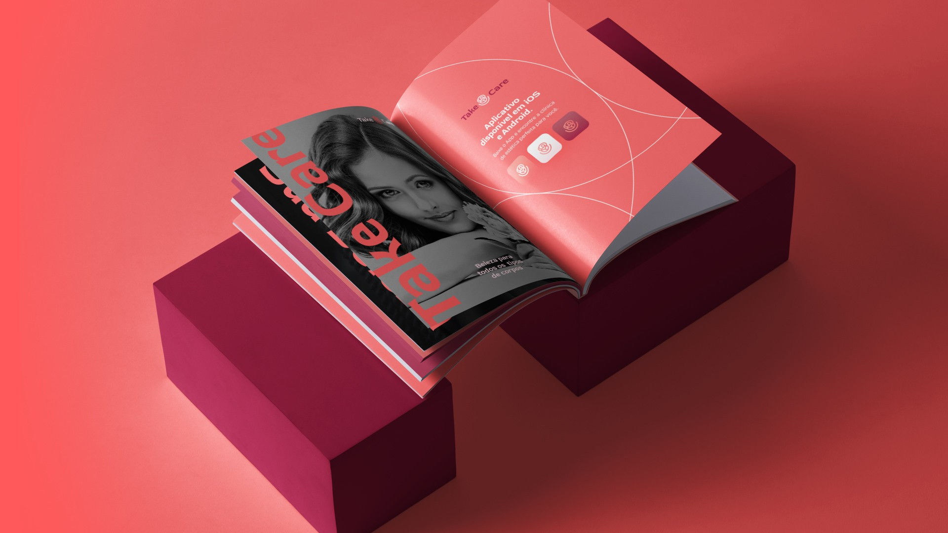
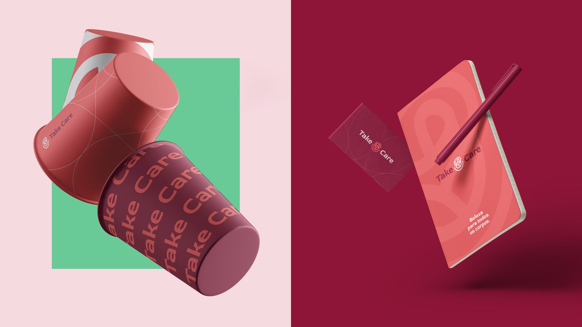
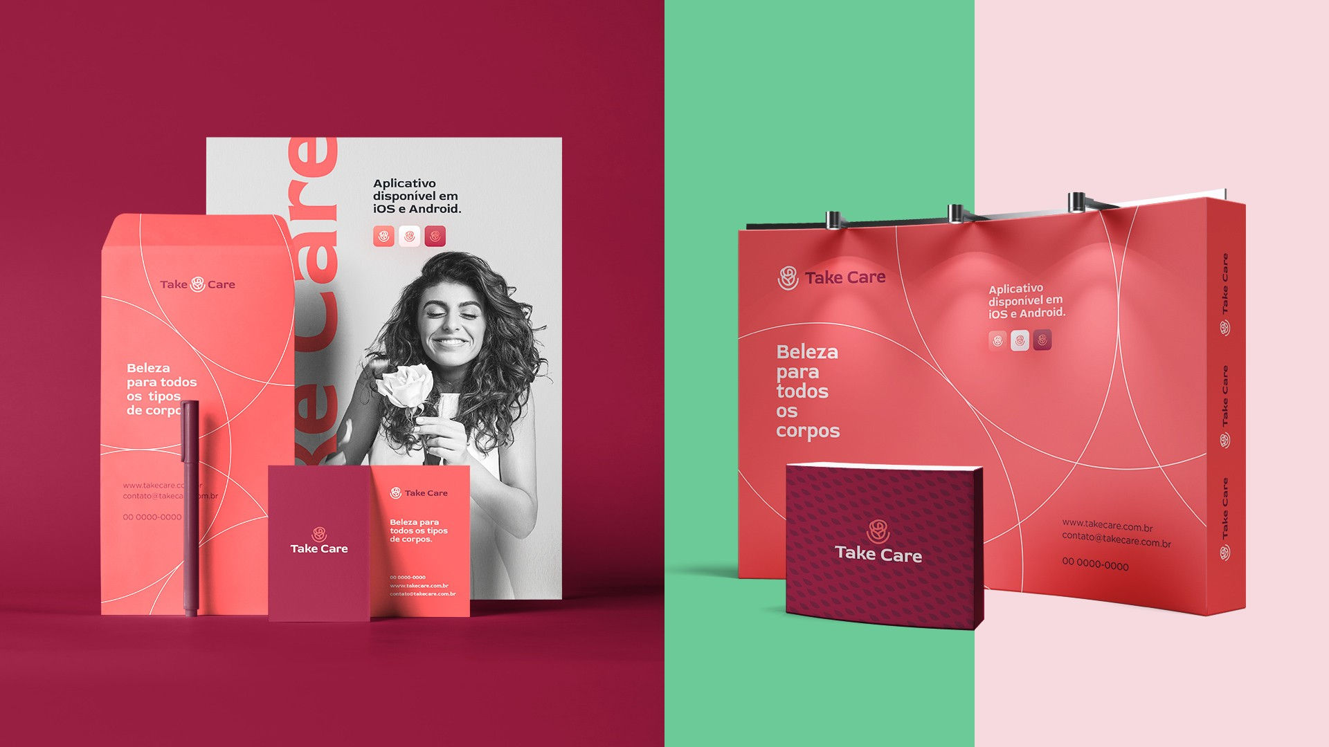
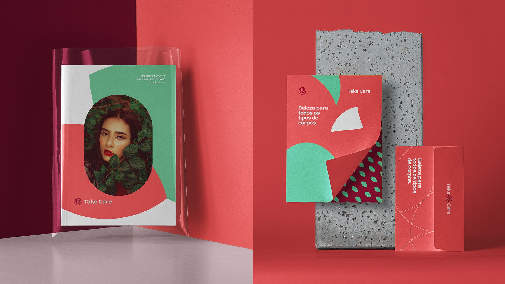
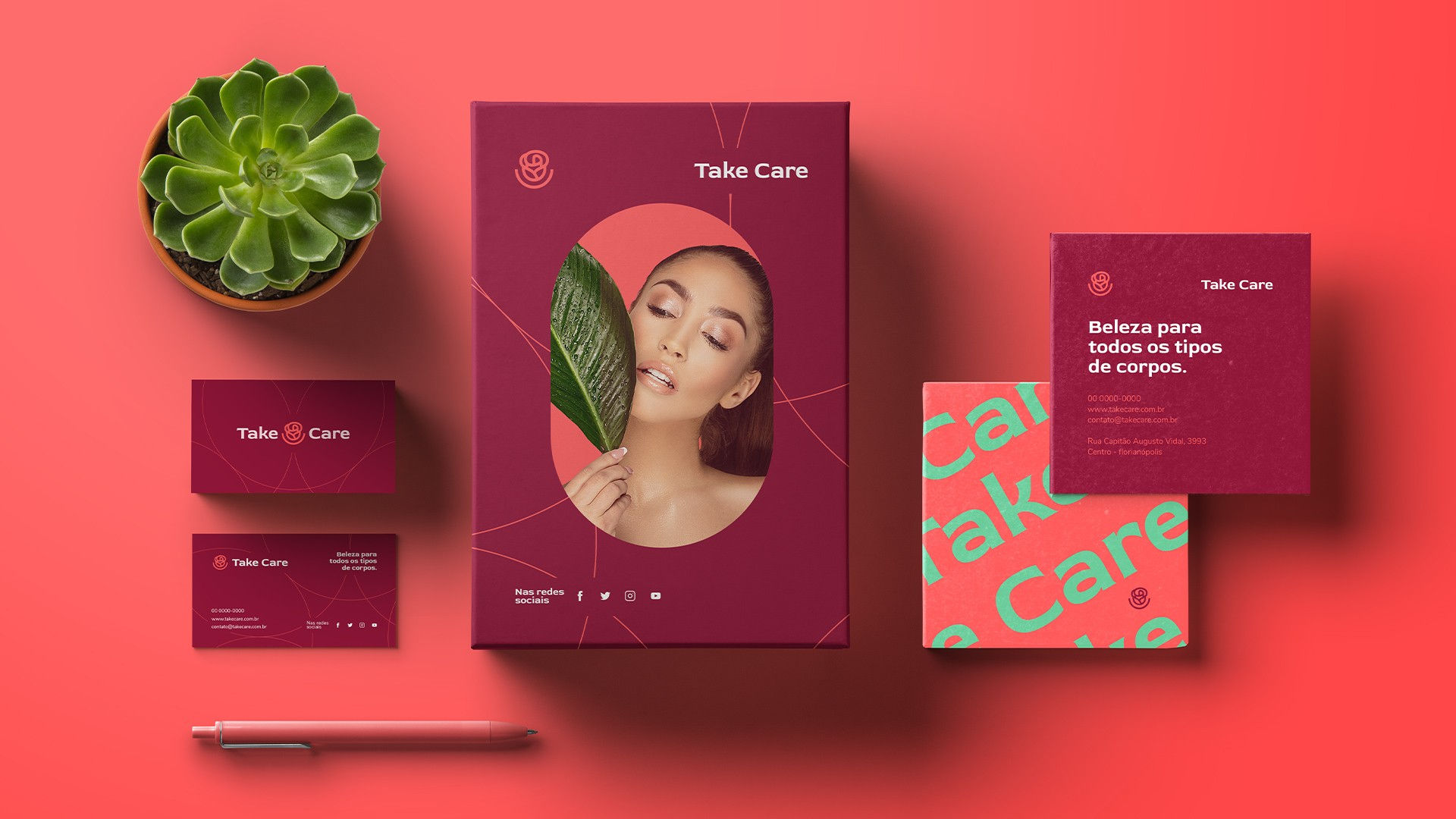
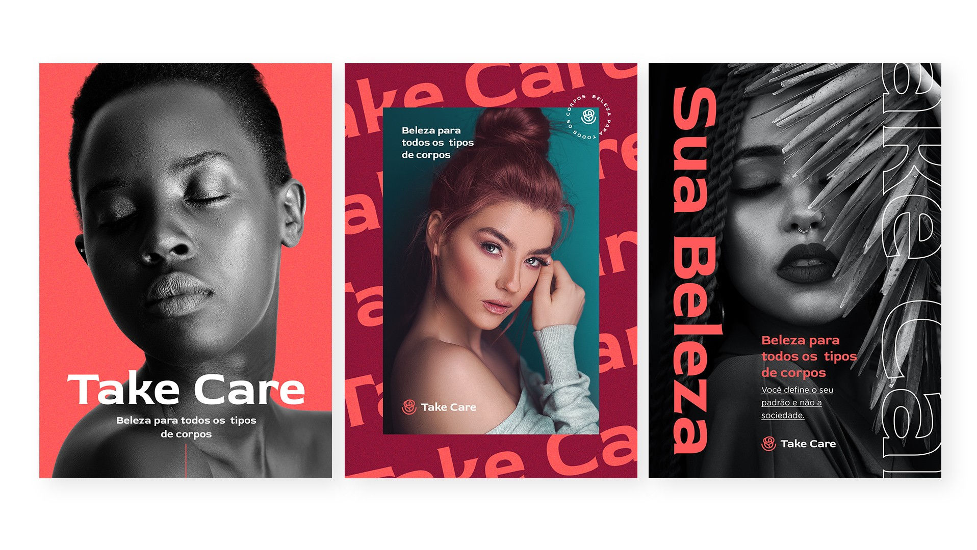
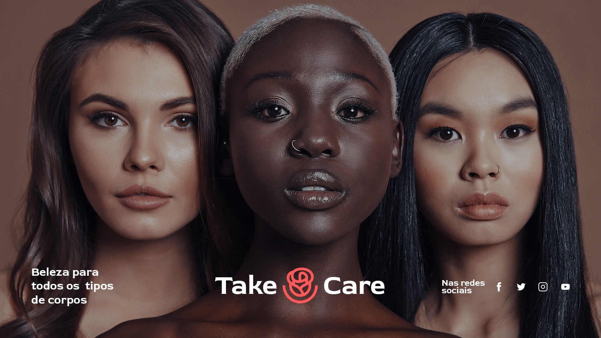
We worked with Take Care to create a brand identity that celebrates femininity, diversity, and self-care. Inspired by the rose—a timeless symbol of beauty and strength—the design honors the uniqueness of every woman, while the arch beneath it represents care, joy, and acceptance.
More than just a logo, the identity reflects Take Care’s message of self-love and empowerment, reminding women to prioritize their well-being. Through thoughtful design and symbolism, we helped bring their vision to life, making self-care central to their brand.